Best LED Sign Board Manufacturers in Chennai | Signage Chennai

Imagine a shop bordering a busy highway road. All the vehicles are cruising at a speed of over 70 km per hour. Is the challenge for the business evident? Yes. The shop must be appealing enough for the ongoing traffic to make a stop at the store. But normally the probability of someone weaving through the busy lanes to actually slow down and make a purchase at your store is next to none.
That’s where the Sign Board Manufacturers in Chennai play a pivotal role. The first thing–assuming it is not one of the regular customers–sees at the store, is never the store. The signboards outside make the customers walk into your shop. These signboards are the first line of advertisers about the brand and its nature.
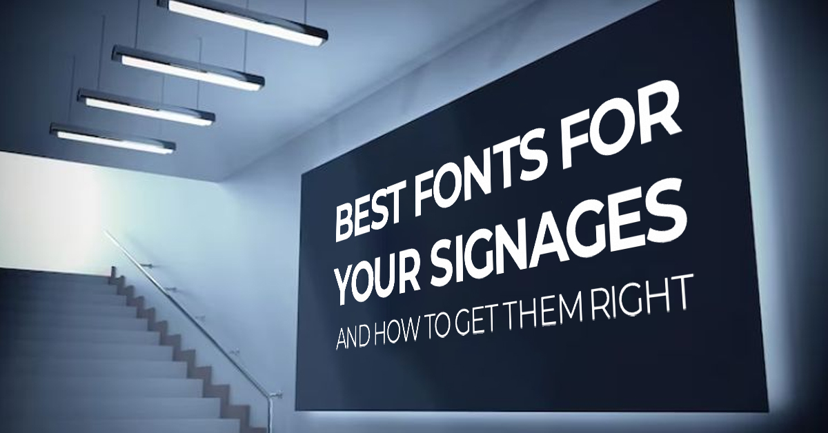
Apart from creating a wonderful design and impressive content for the signboard, the owner of the business forgets to consider one crucial factor that can make or break the design–FONTS!
How the message is shown is equally important to what is shown on the signboards. Here are a few fonts to make incredible signboards that stand out and how to get them the right way!
What fonts to use for large formats?
Large format signboards generally mean the name board of the shop or any promotional banner outside the store. For instance, LED Sign Boards in Chennai are considered large format signboards. Here are some recommended fonts to make the signage appealing:
1 – Helvetica

2 – Bebas

3 – Futura

4- Avenir

Having said that, it is not a hard-set rule to stick to these five fonts suggested. The list serves as a broad outlook on the fonts suggested or liked by most frequently. Any font that drives the point home is a good alternative. The Name Board Makers in Chennai would recommend the best fit for the business with their collective experience.
What fonts are NOT to be used?
There may be a number of fonts that would look good for the business other than those suggested. But, any design would face colossal failure if inappropriate fonts are used.
It is highly recommended by many experts NOT to use comic sans as they appear informal and are not eligible for easy reading. Papyrus and any other script fonts should be ignored as an alternative during the design process because of the thin, hard-to-read typography.
Getting everything right!
To make the signboards work for the benefit of the business, here are some proven ways to get the fonts in order for printing!
1 – Simplicity is the key
Sometimes, grandeur fails to evoke any emotions. Hence, it is always a safe bet to aim for simple, concise, and impactful design. Fonts must be easy to read. They should have the capacity to draw people’s attention from a long distance.
2 – Spacing and size
Words stuffed together or on the other extreme, spaced out more than needed are bad for the design. Use the ‘white spaces’ strategically to improve the design quality. It is better to avoid thin letters. Bold fonts on Metal Letters Chennai work wonders in attracting attention.
Choosing the appropriate font style for the signboards significantly impacts the design quality of the same and also proves beneficial in driving prospective sales for the business.