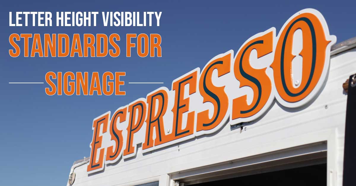
Letter Height Visibility Standards For Signage
When you design signage, what is the major thing you look for? Everyone will mainly look for the design or material in the signage. The letter size is underrated, and many go wrong at this. Letter size is also referred to as “letter height.” The letter size determines the distance used by the reader to read your message. So, the size of your text should neither be small or big, which can affect the reader’s visibility. Thus, letter sizing is a crucial part of designing the signage. So, choose the best?sign board manufacturers in Chennai to know the key features of letter sizing. Hence, in this post, let us see the letter height visibility standards for signage.
Font size:
The foremost tip in determining the font size of your signage is to understand at what distance the audience will look at the signboard. The fundamental or the thumb rule in font size of your message for every 10 feet distance, increase one inch the height of letters. For example, if you want to view your text at a 150 feet distance, your letter height should be 15 inches. So, as the distance increases your text height should also increase. Here are some standard letter sizes which you may find useful:
- Yard and political sign board: 5 “- 7”
- Sidewalk and roadside signage: 6″-12″
- Window/ storefront display: 8″-12″
- Grand opening, event signs, and real estate: 12″-24″
- Business signboard: 24″-48″
- Directional and traffic signs: 10″-14″
The name board makers in Chennai?are best in creating signage with the appropriate size that makes every head turn.
Upper and lower case:
While conveying or emphasizing a message, many tend to use all capital letters. Experts say that if signage involves capital and small letters, the impact on the readers is quite high. They even say that many business owners tend to make this mistake while representing their brand. They all go for upper case letters which can decrease the readability of the audience. Thus, using upper and lower case gives a distinctive shape to your text, which allows the readers to read the message 15% faster. Business owners can use LED signage or basic metal letters Chennai to develop text in sentence cases for higher readability.
Styling the font:
Thirdly, focus on the style of the font. It is known that one should never include more than one font style in the text. It can often confuse the eyes, and readers may not read your entire text, which is a loss for your company. So, always stick to one style, and if you want two styles make sure whether they are related or similar. Font styles like Calibri, Arial, Garamond, Helvetica, Futura, Tahoma, Verdana and Trajan are chosen by many signage manufacturers. LED sign boards in Chennai are the ideal option for your digital signage because of their advanced features.
Hence, these are things to consider while designing a letter size on signage. Choose Hitech vision sign boards Chennai for your next sign board that offers quality works at an affordable price.


